Posts Tagged ‘Newsletter design’

Color – the Most Sensitive Part of a Brochure or Newsletter Design

Tuesday, June 29th, 2010

Color is a most important ingredient for design. A must among the details of print and electronic design, color is a very delicate choice for the design of a professional newsletter, brochure, website or any other publication. The most sensitive part of a design element, color is evocative of the message that a brochure or a newsletter speaks out. ip locator . A palette of harmonious colors can elicit response from the viewers and readers.

Cool colors are soulful and soothing. A glimpse of cool colors casts a calming effect on the eyes. On one hand, cool colors are cold and glacial. On the other, they are nurturing and comforting. Green, blue, gray, silver and neutral white are from the palette of cool colors. In the east jump world of nature, green and blue are predominant colors. Nature is steeped in the pool of these life-sustaining colors. Cool colors appear not brighter and stronger than warm colors. However, the cool colors are visually appealing and aesthetic.

If cool colors soothe the mind, warm colors excite the senses. Worm colors are capable of conveying strong emotions from optimism to violence. The warmth of such colors as yellow, red, pink, orange, violet and black can evoke anger or create excitement. In nature, the palette of cool colors is not independent of warm colors. The neutrals of brown and black are the attributes of warm colors. The warm colors of seasonal fruits and flowers represent the changes in the cycle of seasons.

The profile of both cool and warm colors is rich in meaning. All of them are descriptive and illustrative if they are deliberately put to use in an art or design work. Ultimately, it is the imaginative faculty of a designer to tell him or her which colors go well to be mingled harmoniously in the design of a brochure or a newsletter.
Focus on the Essential Content Details of a Professional Newsletter – Part 2

Monday, June 28th, 2010

Text

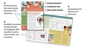
Next to nameplate and masthead, text is the principal body of a newsletter. The look of the text that a professional newsletter features varies with the chosen type size and style. The number of columns also matters. Newsletters are nowadays designed on computers that store a complete palette of type styles and sizes to be used in printers. It is better to be done with the text of a newsletter in a professional-looking typeface structure gonflable that is akin to the typeface used mostly in newspapers and magazines.

  • Though it is recommended to use one particular type size and style for a newsletter’s text, a professional designer can make a rich mix of different type sizes and styles to improve the look and feel of newsletters.
  • Another decision to take is the number of columns and their width. Having one column is a choice of many to keep the page simple and clear.  Some topnotch newsletters are remarkable examples to it. It takes comparatively less time to create a newsletter in this format.
  • The wider type line and the bigger type face make the text of a newsletter an easy read.  Make sure to keep margins on either of the sides so that a reader’s eyes do not move far to read a line. A newsletter with a one column format and an inch margin is ideal.
  • Two-column, three-column and four-column are alternatives to one column. If any of these alternatives is your preference, be careful about spacing between two columns. The inter space should not be so large as to make the text not pleasing for the eyes.

Headlines

Headlines are one of the professional inflatable water slide makings of a newsletter. To fetch attention to the newsletter, make sure to compose well-thought out headlines and keep them bold. Headlines should be catchy and meaningful. Newsletters with insubstantial headlines are left unread.

Departments

Most professional newsletters come with departments. A newsletter with a department is easy to read. To be more effective, the department of a newsletter needs to be kept in the same place and the same format with every issue.  The department should be as simple as a box of contents to make readers turn the pages of the newsletters.

Charts and graphs

Charts and graphs are specific content design details to loosen the threads of a newsletter’s content if it features complicated information. They are good for a quick read of newsletters. Be sure to make charts and graphs readily understandable.

Art and Photographs

Art and photograph add to the visual aesthetics of newsletters. Many readers feel drawn to the visual appeal of a newsletter. It is sensible to use them only when they are illustrative of the message that a newsletter delivers. Incommunicative art and blurry photographs mar the purpose of newsletters. expiration of domains  Make sure to keep a caption or cutline underneath the photograph. A well-written cutline is a clicking idea to make the reader go through the newsletter content.

Color

Two things are considerable about the color of a newsletter. One is the paper color of a newsletter in combination with the ink color. Another is a second ink color or spot color.  White paper bouncy castle with black ink is the most preferable and readable color combination. Whatever be the color combination, it must be soothing and pleasing adding to the readability of the newsletter. Spot color adds distinction to the visual appearance of the newsletter.

Focus on the Essential Content Details of a Professional Newsletter – Part 1

Friday, June 25th, 2010

Newsletter is a printed or online form used by a company to deliver formal and informal news to its customers. Being a non-verbal spokesperson of business organizations, newsletters must look professional. Therefore, the design and look of a newsletter is important. Only well-designed newsletters pique the interest of readers. Nameplate, masthead, departments, headlines, art, color, photograph, graphs and charts are the design essentials of a professional newsletter. All these building blocks work together to attribute a unified and unique look bouncy castle to a newsletter. A creatively designed professional newsletter is newsy in content and read.

Nameplate, the topmost part of the first page of a newsletter, highlights the name of the newsletter. It is not necessary to keep it at the top. It can be in the middle, at the bottom or along the side as well. The nameplate contains such details as the title, subtitle, origin and date of the newsletter. The nameplate is often taken as the masthead. But it is a mistake. Check the nameplate content given below -

“Newsletter” should not be the title of a newsletter. Think of a title as an index to the newsletter content. The title strength must not extend beyond two or three words, since brevity is the soul of wit. Keep it bold so as to make it distinctly noticeable.
Give a subtitle as explanation to the newsletter content. It supports the title and vivifies the matter to clear the confusion of readers.
The nameplate of a newsletter also highlights the source or origin of the newsletter. It helps the readers recognize the sender of the newsletter. The address castillo hinchable as well as subscription information is among the contents of the masthead. Put the name of the sender in the nameplate.
Date is an important detail of the nameplate content. If you send newsletters in a series to your customers or readers, it is necessary to date them so that the receivers can track the series of newsletters.

If a newsletter is written by only one person, adding a masthead to it is not mandatory. Masthead is a must need, if a newsletter is available through subscription. Make sure to keep the masthead at the same place in each issue of the newsletter. To be put either at the bottom of the second page or on the back of the last page, a typical masthead mirrors the nameplate and contains the details like authors, contributors, address, contact number, date and subscription number.

Next blog under the same title would be a discussion on the other content essentials of a newsletter.